Introduction
In one of my earlier posts I wrote about the most commonly used meme font and how you can create a meme with Photoshop, and I wrote a list of easy to use online meme generators. In another post I explained memes and why they could become so popular, if you asked the same, you might want to read my post. But now I want to go a little bit more into detail about the meme font and why so many people use it in their memes, that means I will now tell you a little bit about the font in question, about the designer of the typeface and why it is so accepted and used by almost all meme creators.
The Font In Question And The Designer
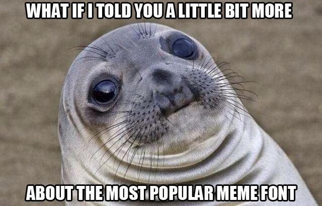
The most used meme font is called Impact and the typeface was designed by Geoffrey Lee in 1965. Yes, you read right, the font was actually designed before the internet was a mainstream network for us all and much earlier before the funny memes made their rounds in the world-wide-web.
Geoffrey Lee was born in Wimbledon, UK. He took a correspondence course in advertising during his service in the RAF. In 1950 he started to work for an advertising agency as a checking clerk. He worked for different other agencies until he settled for Pembertons in London, his role was type director and he became head of the graphic design unit. He designed the Impact font at Pembertons and for the British foundry Stephenson Blake in Sheffield.
In 2004, Geoffrey Lee popped up in a typography related forum under the username “gyl” and explained why and how he designed the font, today you can only find the thread through the web archieves. Geoffrey Lee created each letter of the font using hand-cut metal. The font was designed in the time of metal typesetting but short before phototypesetting became popular.
He mentioned that it was difficult for British businesses to use any desirable designs from foreign foundries. The cost of importing was considerable as he said, and the designs had to be planed down from the European height of .928 inch to the British .918 inch. He mentioned that adsetters could afford to pay the much higher costs, but the average British printer couldn’t. A home-grown product was needed.
As the name suggests, Impact was designed to stand out, to give impact. He made efforts “to get as much ink on paper as possible in a given size with the maximum possible x-height”. The typeface was intended for headlines, to make text stand out in ads, posters and billboards, the bold font of Impact found rather limited use in other text applications.
Impact And The Popularity In The Digital Era
Around 1990s the digital composition started to dominate the letterpress and Stephenson Blake had to quit the type business and reorganized. At that time they also started to give out their digital rights. The type foundry Monotype got the font Impact and they licensed the font to Microsoft.
At some point Impact was digitised. Microsoft included the font in a standard font pack called Core fonts for the Web, a project started in 1996 and terminated in 2002. The font gained popularity 1998 when Microsoft dispruted it with Windows 98. Since then it is a core font and included in every following Microsoft Windows operating system and one of the reasons why it became that popular.
What worked back then for advertisers or publishers, must work in the digital era too. The reason why so many content creators use the Impact font for their memes is the same as back then. Simplified you can say that the Impact font became so popular as it allows the content creators to make a text like a punchline stand out heavily, the font is very pushy.
Technically described that is possible due to the ultra-thick strokes and compressed letterspacing. And as Geoffrey Lee described his own typeface back then, due to the “maximum possible x-heigh”. The font simply makes letters easy to read, it makes messages appear pushy, and the name Impact is therefore more than appropriate.
How the font was distributed and how the font appears, both factors combined did probably create some kind of herd mentality, to make almost all meme creators use this particular font. In the 2000s, captioning of images became more and more popular and people shared these images at more and more places in the web, back then they were often called image macros.
As Microsoft Paint was always pre-installed in Windows operating systems, anybody could try to create them, but some people also used more specialized graphic applications and liked to create memes with Photoshop or other graphic tools. No matter which tool, the process of captioning images is one of the easier editing tasks, and it explains one of the many reasons why memes became a widespread phenomena.
Many different fonts were used for image captions, but as MS Paint was pre-installed in Windows, so was the Impact font. This combined with the pushy features of the Impact font probably made many people realize “I can stand out with my image if I use that font”. People want to get their messages noticed, and that’s exactly what the Impact font allows and was designed for. If this is the reason, it would be some kind of irony, because now that it is the most used font for memes, it’s rather difficult to stand out from the mass.
Conclusive
The Impact font found a place in the digital era as well, technically it still does what it is intended for. With that said, it doesn’t mean you shouldn’t use another font for image captions. Maybe it’s even a good idea to check out other fonts that work well for your images. While the font is still very popular, and while this popularity won’t dissapear over night, it’s not too bad to go the individual route. Do you have other favorite fonts for image captions? Drop your opinion in the comment section…

For those of us who personally worked with fonts before digital existed, almost all the fonts we use today have been around in one form or another for a long time, many of them for hundreds of years. I remember when we had to go tot the art stores and buy fonts on special transfer sheets when we were designing brochures and stuff like that. They NEVER gave you enough vowels.
This is something I learned while researching. Although there are so many new fonts as well, it’s very interesting that a lot of fonts that were created before the digital era are still heavily used today. You are right, there are many examples… Times New Roman is for example from 1931… that’s something I didn’t really know before I researched.
Thanks for sharing your memories about the art stores, to me this is very interesting, I am 33 years old and basically born in the time when computers slowly started to go mainstream (Atari, Commodore C64, and Amiga accompanied me in my teenage),… it’s interesting to hear how things worked before that time. Although I believe I have seen my mother use these sheets too but I was so young. 🙂