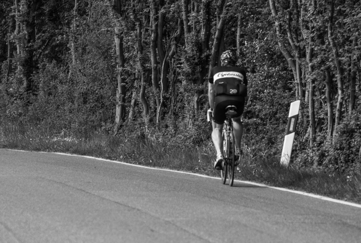
Here is a photo of a cyclist. The colored version of the photo was fine but I liked it more in black and white. The cyclist was not completely in focus and that’s also why black and white works better. As I often preach, black and white will hide issues like soft focus if the problem is not too big.
- Comment
- Reblog
-
Subscribe
Subscribed
Already have a WordPress.com account? Log in now.

Looks cool — but I kind of want to see all that green!
I wouldn’t have converted it but the unsharpness of the cyclist annoyed me a lot.