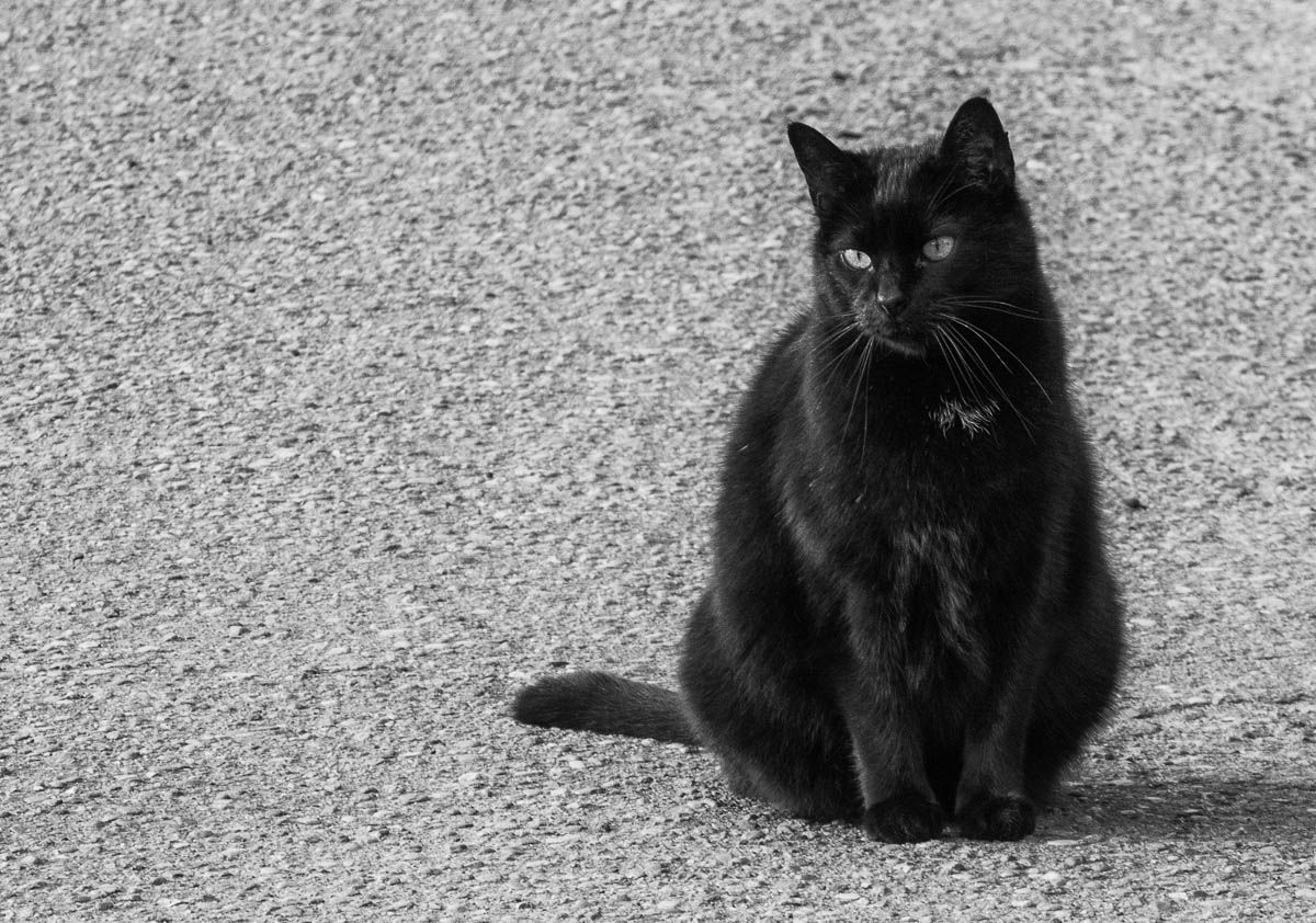
Above is an older photo of a cat. I shot this photo in 2017. The highlights were overblown and the colors were boring as well, which is why I decided to convert it to black and white. I also cropped the image on a way that the cat is more on the right side of the image. I am not sure, it just looked much better than having the cat in the middle, especially after I flipped the image horizontally. I think what I liked about this was that the cat is now looking into the empty space on the left. It looks much cleaner this way, almost on a minimalist way. I like the photo much more now. I shared the same cat already back then, but I like the new edit in the current post much more.

much more dramatic in b/w. Some things don’t need the distraction of color.
Agree, sometimes black and white is the way to go. The original didn’t have the greatest colors anyway.
I like the image. Sometimes it is better to have more room in the photo on the side that the subject is looking or moving. In your photo, leaving more room on the left works better that if you left more room on the right.
Yes. I tried both but since the image was flipped horizontally and the cat was now looking to the left, placing it on the right worked better… since it looks into the empty room and not out of the image.