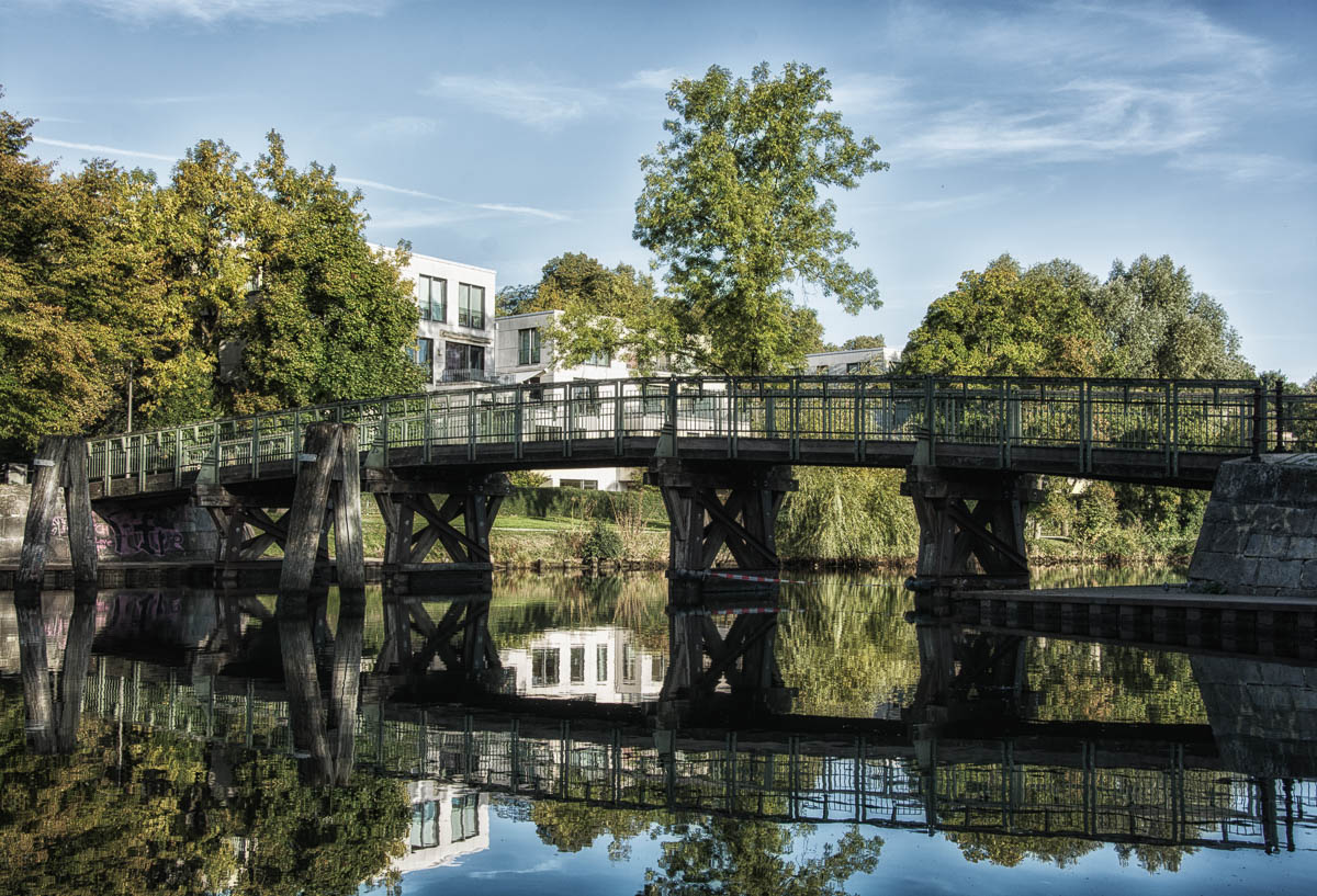
I thought I do one of this before and after editing posts again. But as always I show you the edited photo first and the bad one last. I found the picture above in my library and I shot the photo somewhere in Lübeck two months ago. The bridge in the scene is there so that people can cross the channel. That’s possible at different points around the historic district, because we have different bridges for pedestrians but also for cars. The historic district of Lübeck is basically an island enclosed by the Trave, that’s why these bridges are so important. If you go from right to left in the photo, you’re basically leaving the old district and island. That’s also why you see these modern white structures there. I like to take photos of bridges, I don’t know why, maybe it’s the shape and sometimes also the fact that I like how they reflect in the water. But now let’s see how the image looked before I started editing it…
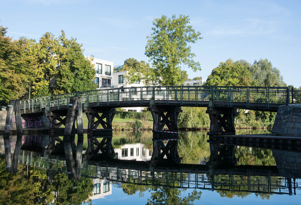

I liked this picture. I do have to admit, it was hard seeing the differences between the two pictures. What finally caught my eye was that the bottom picture has a red and white rope “barrier” between the legs of the bridge, on the middle right side. It is brighter in the bottom picture.
Biggest issue was with the original that it was slightly overexposed. Look at the heaven to see the difference. By decreasing exposure, the clouds became visible and the blue got darker and more beautiful than the way too much lit heaven in the original. Next big difference is that the original barely had structure or details, and I added them. Especially the dark shadow details. That’s visible when you look at the posts of the bridge, they got more detailed and brighter in the first image. After that I adjusted the tonality of the upper half of the image and the lower half to make the heaven yet again a bit darker and to change the tonality of the water a bit. Then I changed how the sunlight appears, by using some kind of sunlight plugin. There was also sharpness added to the picture.
There was a lot going on. I’d guess you didn’t notice it because the small images in the post are badly compressed… WordPress.com has a very ugly way to compress images within posts. There difference gets apparent when you see the photos larger. For example if you load up both in browser tabs and switch back and forth between them. You see a larger version of each if you click on the images.
I’d say the difference is night and day 🙂
Wow! You must really be a photographer to know all of that, and for it to just “pop out” like that. Thanks for the reply, I am always interested in getting engagement with other people.
Thanks. Before I started with photography, I always liked to mess around with graphic tools like Photoshop. That definitely helps now that I am into photography as well.
I did notice the difference in the sky particularly, that definitely looks more interesting than the original. I like the structure of the bridge and the reflections. I’ve seen a lot of nice bridge photos this week as the Photo a Week challenge has been about bridges.
The other differences are more apparent when you click on the images and compare them larger in two browser tabs. WordPress.com does compress images within posts very badly. It’s kinda sad.
But yeah, the sky was a problem, I wanted it darker and wanted to see clouds. Everthing else was adjusting levels, contrasts, tonality.
I wish WordPress wouldn’t compress images within posts, it makes them look worse than they are, but maybe I am fussy 🙂